Architectural Rendering Composition: Framing, Thirds and Eye Level
How framing shapes a render: rule of thirds, eye level, straight verticals, one- or two-point perspective, depth layers and the most common mistakes.

Same model, same light, same materials… yet one image invites you in while the other looks like an ordinary screenshot. Most of the time the difference is not the render engine but where the camera stands and what enters the frame. Architectural rendering composition is about choosing where the viewer’s eye starts and where it comes to rest. In this article we walk through the core principles of framing, the rule of thirds, vertical lines and eye level, using architectural images as examples.
Why composition matters as much as light and materials
Good light and realistic materials make an image believable; composition decides what the image says. When people first look at a render, their eye goes to the brightest, sharpest or most contrasting area, then travels through the image along its lines. If you do not build that path, the eye wanders and the key idea of the design can get lost in a corner of the frame. So before placing the camera, answer one question: what should the viewer see in this image?
Core principles of architectural rendering composition
The rule of thirds
Imagine a grid that divides the frame into thirds horizontally and vertically. Placing the main element (an entrance, a corner, a window) near one of the intersections usually produces a livelier image than putting it dead center. In exterior views, keeping the horizon close to the lower third leaves room for the building and the sky. This is a starting point rather than a law, though; for a symmetrical facade or a monumental space, a centered frame can be the right call.
Eye level
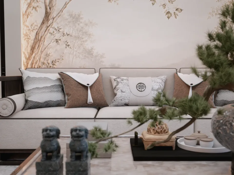
Keeping the camera at the eye height of a standing person brings the image close to the viewer’s own experience. An interior seen from too high looks like a scale model; one seen from too low makes the space feel bigger than it is. Unless you want a deliberate effect, eye level is the safest choice.
Keep vertical lines vertical
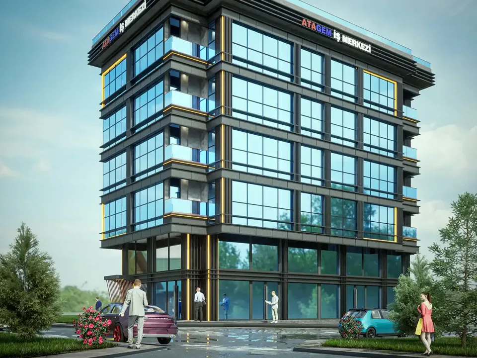
When the camera tilts up or down, the vertical edges of a building converge and the structure seems to lean. In architectural images this is rarely wanted. Keeping the camera level and shifting the frame, or using the two-point perspective (vertical correction) option in your rendering software, keeps walls and columns straight.

Choosing a perspective: one point or two?
A one-point perspective is a frame where the camera faces a wall or facade head-on. It feels calm, orderly and often monumental, and it works well for corridors, symmetrical living rooms and fireplace walls, anywhere with a central focus. A two-point perspective looks at the building from a corner; because it shows two facades together, it conveys mass and depth better. Using both in a presentation series balances dynamic and quieter images.

Lens and field of view
It is tempting to pick a very wide lens to show a small room in one frame, but an extreme wide angle stretches furniture at the edges and makes the room look larger than it really is. That can leave a client disappointed when they see the actual space. Choose a field of view that describes the space honestly, and if needed use two separate frames instead of one ultra-wide shot.
Foreground, middle ground, background
A sense of depth comes from layers. A plant, a table edge or a tree branch partly entering the frame in the foreground; the architecture itself in the middle ground; a view or the sky in the background. These three layers give the image dimension. The foreground element should frame the shot without hiding the architecture.

Guiding the eye with light and leading lines
The eye moves from dark toward light. Placing the main element in the brightest area, or gently darkening its surroundings with shadow, strengthens the focal point. “Leading lines” such as walkways, floor joints, ceiling lines and railings also carry the eye toward the subject. To see the role of light in composition more clearly in night scenes, read our night exterior rendering article; for frames that look down from above, see our aerial rendering article.
People and scale
One or two human figures tell the scale and use of a space at a glance. Use them to balance the visual weight of the frame; place them beside the main element or along a path, not in front of it. Keeping figures at the same eye level as the camera, with their heads near the horizon line, makes the image consistent.

Common composition mistakes
- Trying to show everything in one frame: the focus scatters; pick a single idea.
- Leaning verticals: a camera tilted upward makes the building look like it is falling.
- Horizon dead center: it splits the image in two and often makes it static.
- Important elements cut at the frame edge: a half-visible door or piece of furniture tires the eye.
- Empty foreground: in exterior views, a wide flat ground plane weakens the sense of depth.
Composition works together with light and materials; for overall quality steps, our article on how to get realistic renders is a good companion.
Frequently asked questions
What camera height should I use in architectural renders?
For most interior and exterior images, the eye height of a standing person gives the most natural result. The camera can be lowered or raised when you deliberately want a different effect.
How do I stop vertical lines from leaning?
Keep the camera level and shift the frame up or down, or turn on the two-point perspective or vertical correction option in your software.
Do I always have to follow the rule of thirds?
No. The rule of thirds is a good starting point, but for symmetrical facades and spaces with a central focus a centered frame can be stronger. What matters is that the choice is deliberate.
Want images with carefully planned framing and light for your project? Browse our architectural visualization projects or send us your drawings on WhatsApp; we will get back to you with scope and timing.